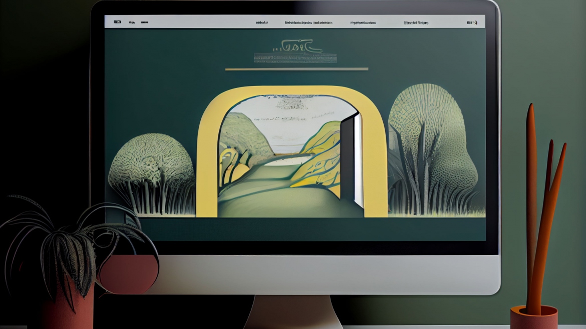
Simple Mobile First Website
We are a small agency with amazing results for our clients, we know where to get the clients and visibility your business need. Starting with affordable websites that are professional looking and provide a fresh face of your business online.
Why Mobile-First Design?
Mobile-first design is essential because it ensures that websites are optimized for the majority of internet users. When websites are designed with a desktop-first approach, they may not perform as well on mobile devices. This can lead to slow load times, poor user experience, and ultimately, lower conversion rates.
Also ensures that websites are designed with a focus on simplicity and usability. Mobile devices have limited screen real estate, which means that designers need to prioritize the most important content and features. This approach results in a more streamlined and intuitive user experience, which is essential for keeping visitors engaged and converting them into customers.
Mobile-first design has become a crucial aspect of web design, as more and more people are accessing the internet through mobile devices. As a result, it’s essential for businesses to create mobile-first websites that are optimized for these devices. In this blog post, we’ll explore some of the key technologies involved in creating a mobile-first website.
- Responsive Web Design
Responsive web design is the process of creating websites that adjust automatically to different screen sizes. This technology ensures that a website looks and performs well on any device, whether it’s a smartphone, tablet, or desktop computer. Responsive web design involves using a combination of CSS media queries, flexible layouts, and fluid images to create a website that responds to the user’s device.
- Mobile-Friendly Navigation
Mobile-friendly navigation is another critical component of mobile-first web design. Navigation should be simple and intuitive, with easy-to-use menus and clear labels. The navigation should be designed for touch screens, which means that buttons and links should be large enough to tap with a finger.
- Mobile-Optimized Images
Images are an essential part of any website, but they can also slow down load times on mobile devices. Mobile-first web design involves optimizing images for mobile devices by compressing and resizing them to reduce file size. This approach ensures that the website loads quickly and performs well on mobile devices.
- Accelerated Mobile Pages (AMP)
Accelerated Mobile Pages (AMP) is an open-source framework developed by Google that enables faster page load times on mobile devices. The AMP framework is designed to streamline the loading process by minimizing the use of JavaScript, optimizing images, and prioritizing content. Websites that use AMP can expect faster load times, better performance, and higher search engine rankings.
Creating a mobile-first website involves using a combination of technologies and design principles to ensure that the website performs well on mobile devices. Responsive web design, mobile-friendly navigation, mobile-optimized images, Accelerated Mobile Pages (AMP), and Progressive Web Apps (PWA) are all key components of a successful mobile-first website. By implementing these technologies and design principles, businesses can create websites that are optimized for mobile devices and provide a seamless user experience.
If you want and need a website and do not have thousands to get one going. Let us see what we can do for you.
myc.agency